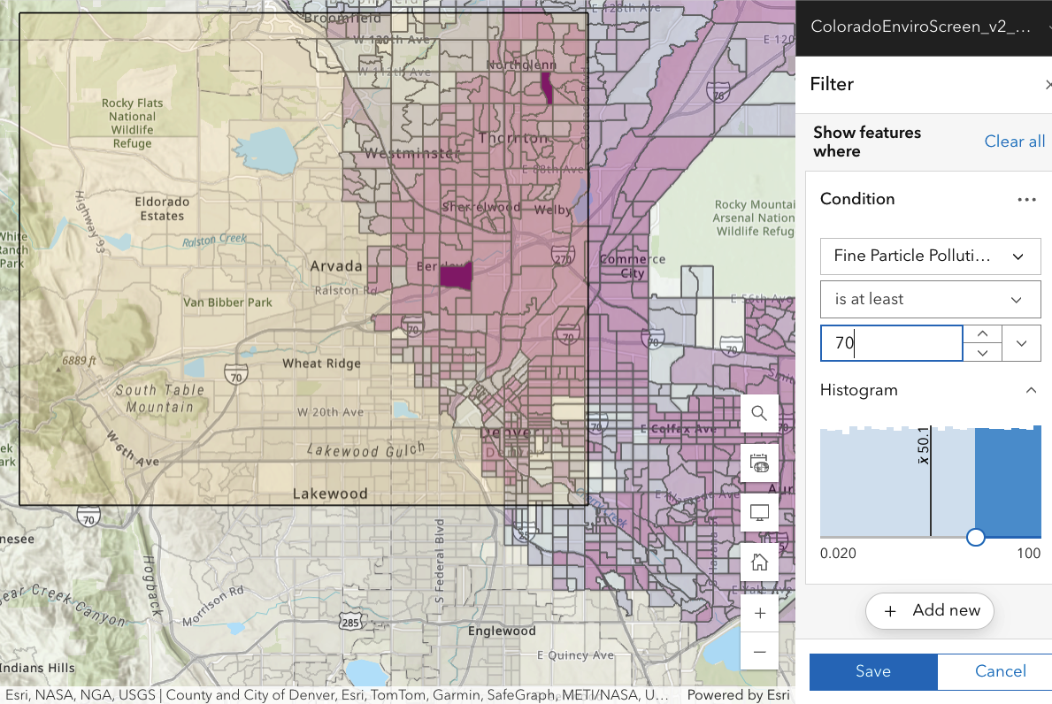
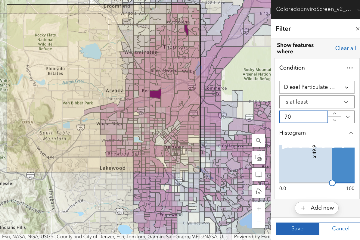
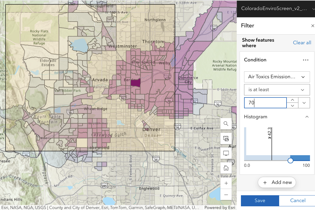
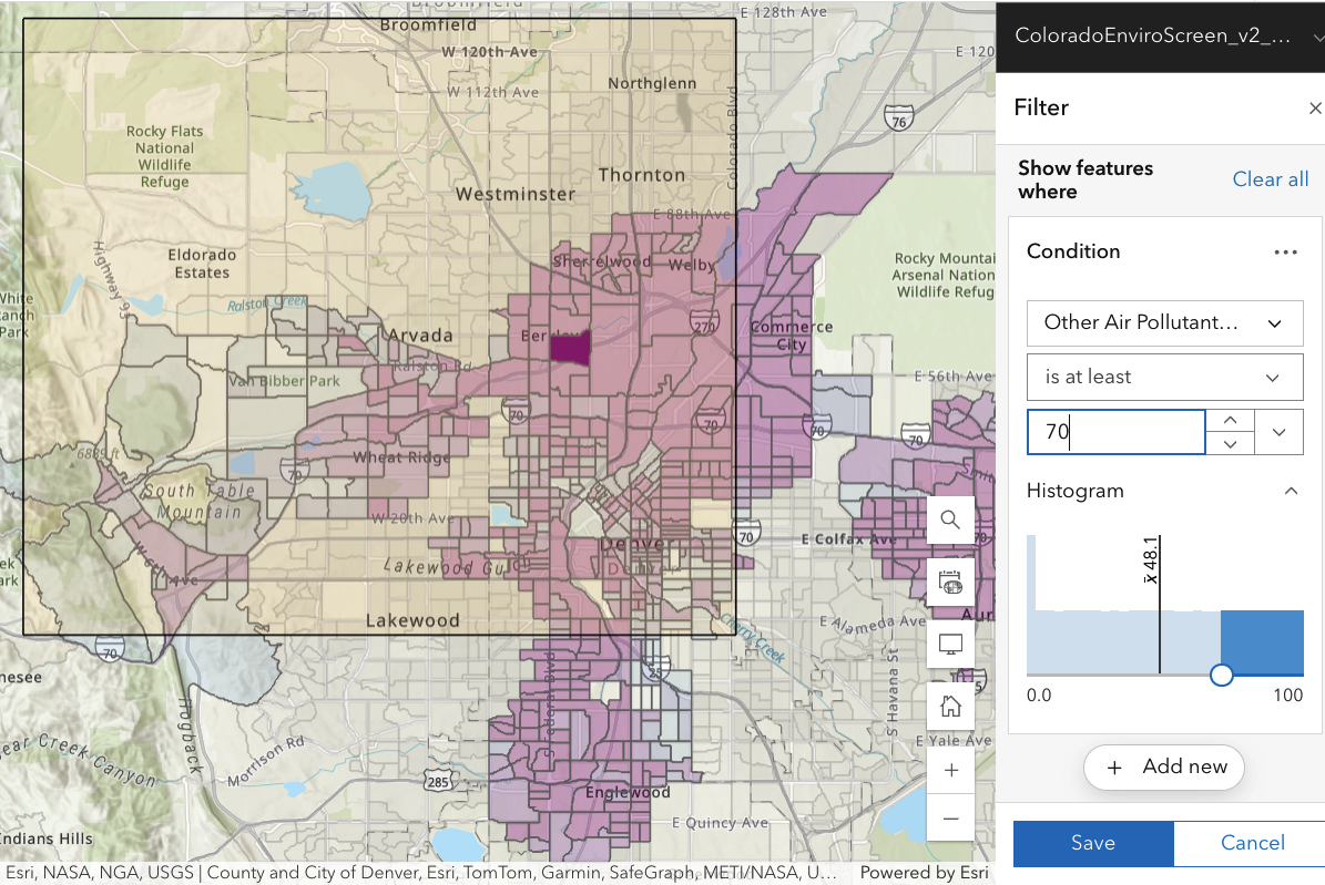
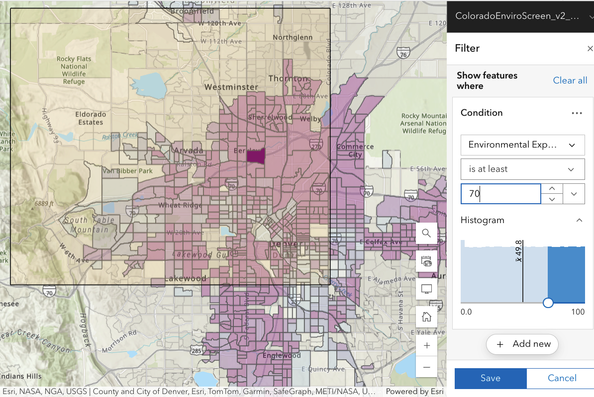
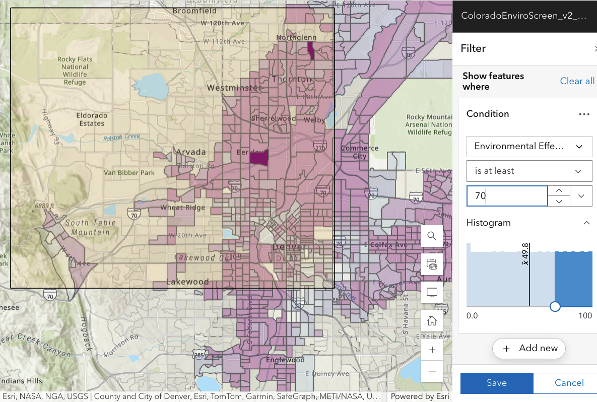
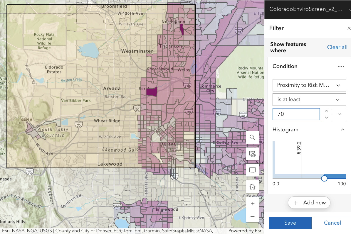
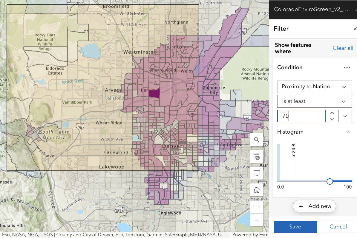
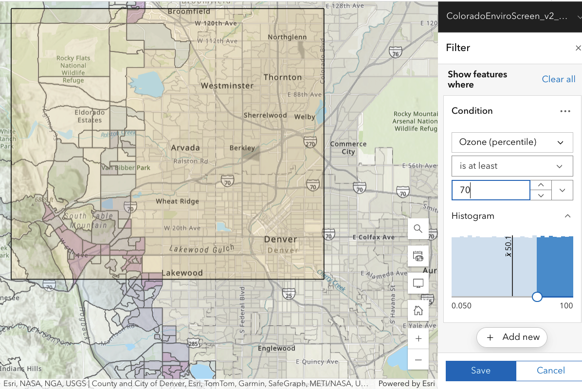
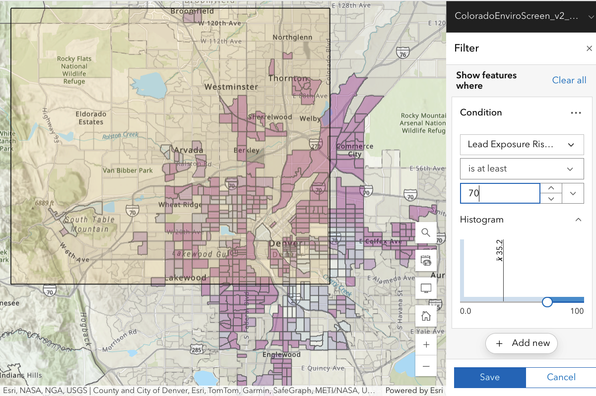
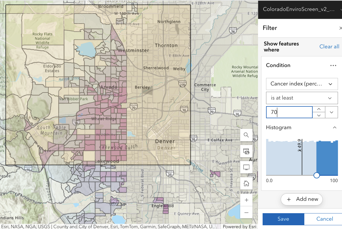
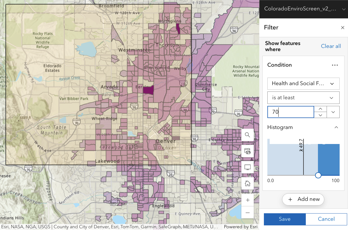
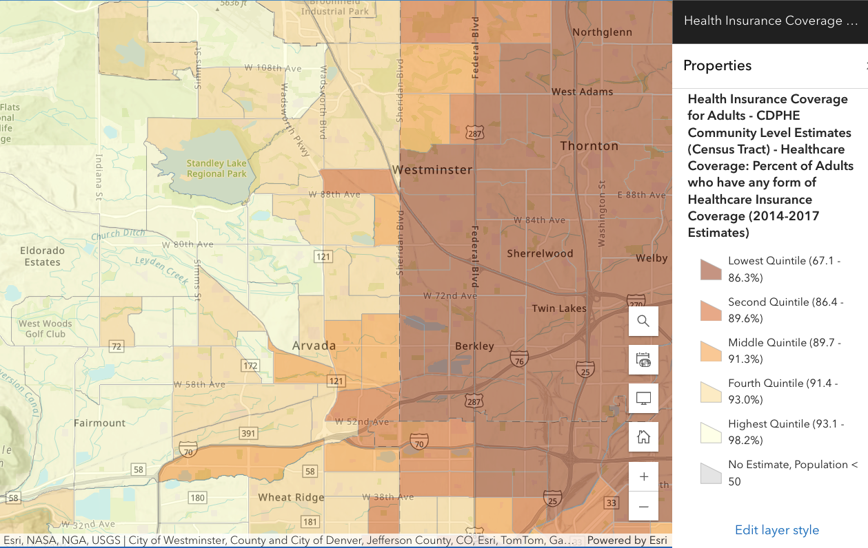
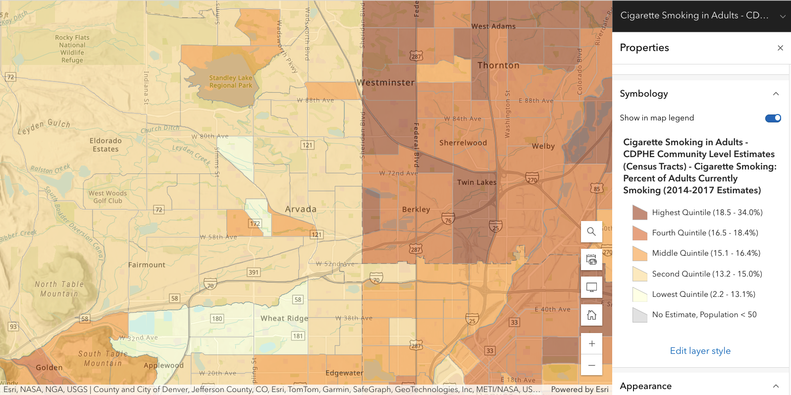
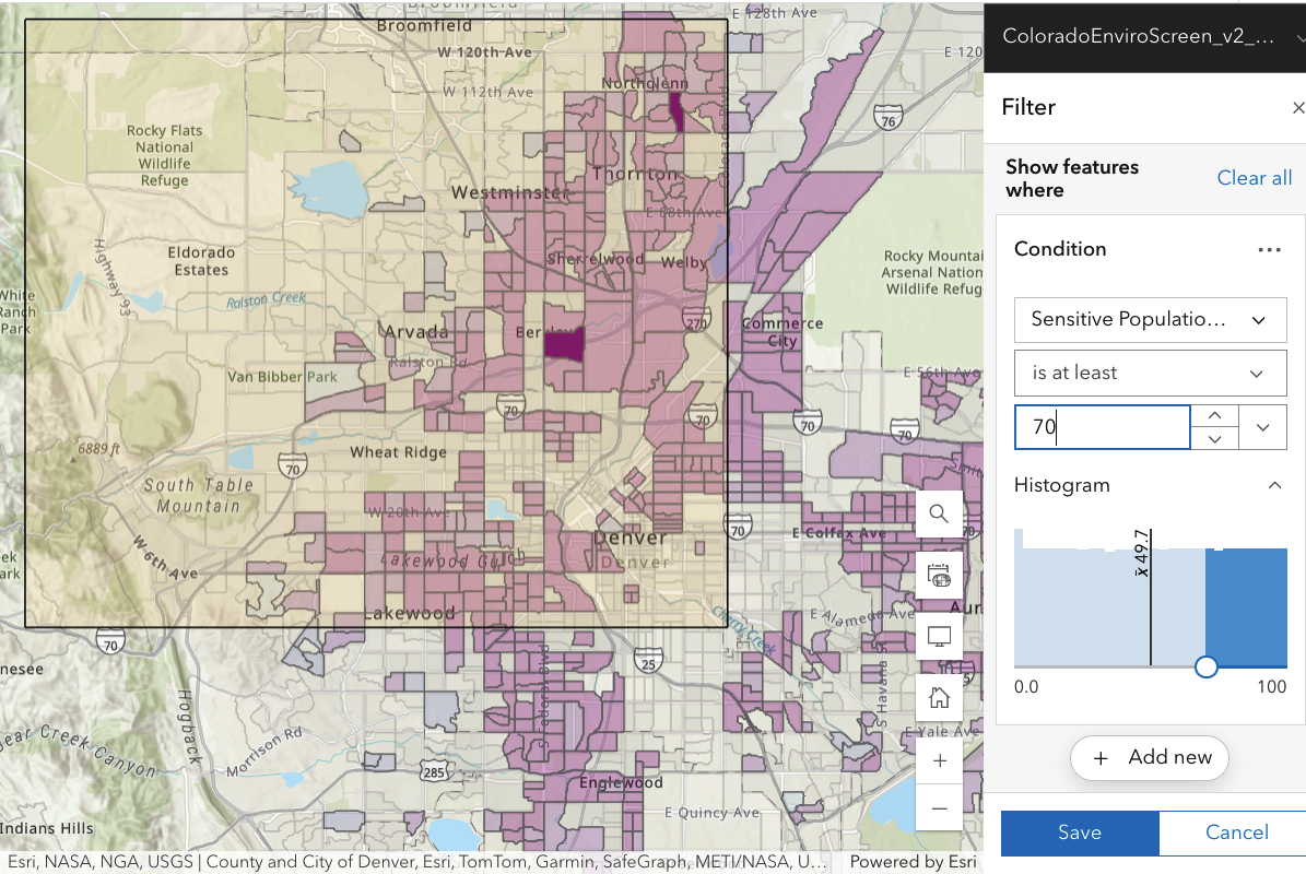
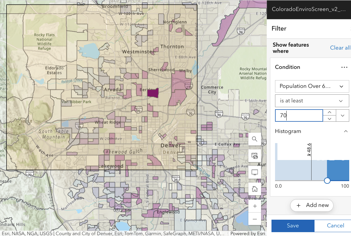
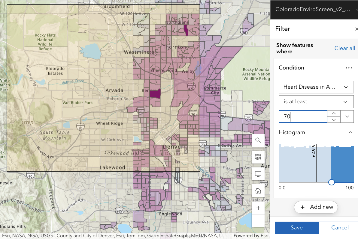
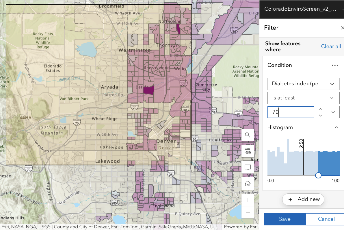
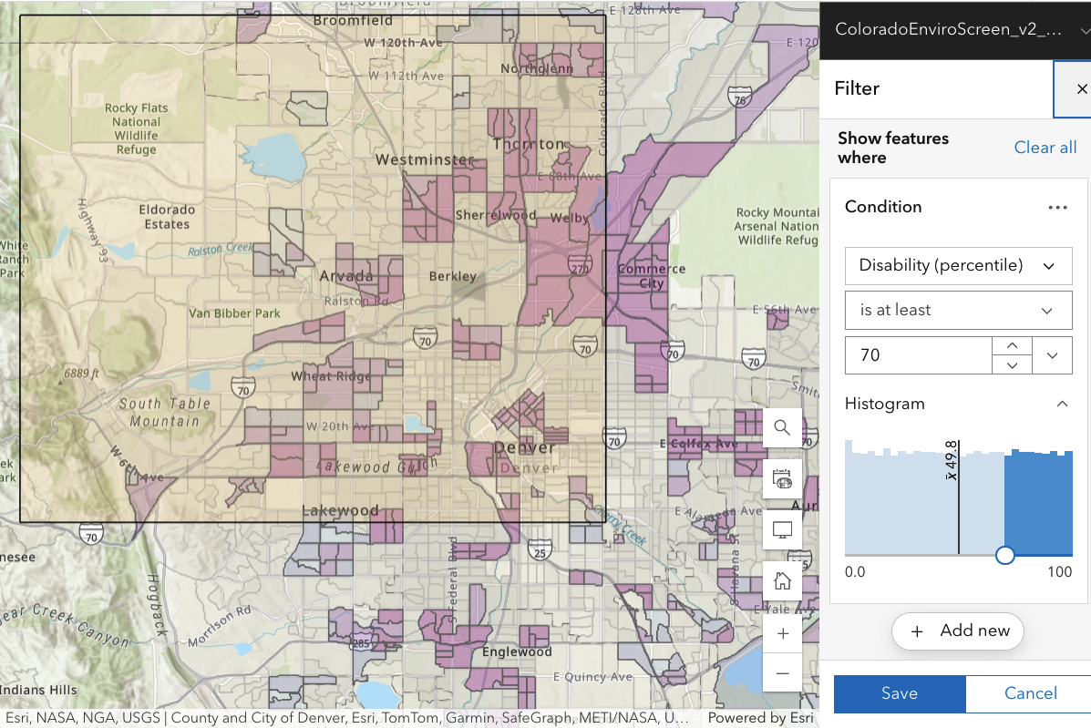
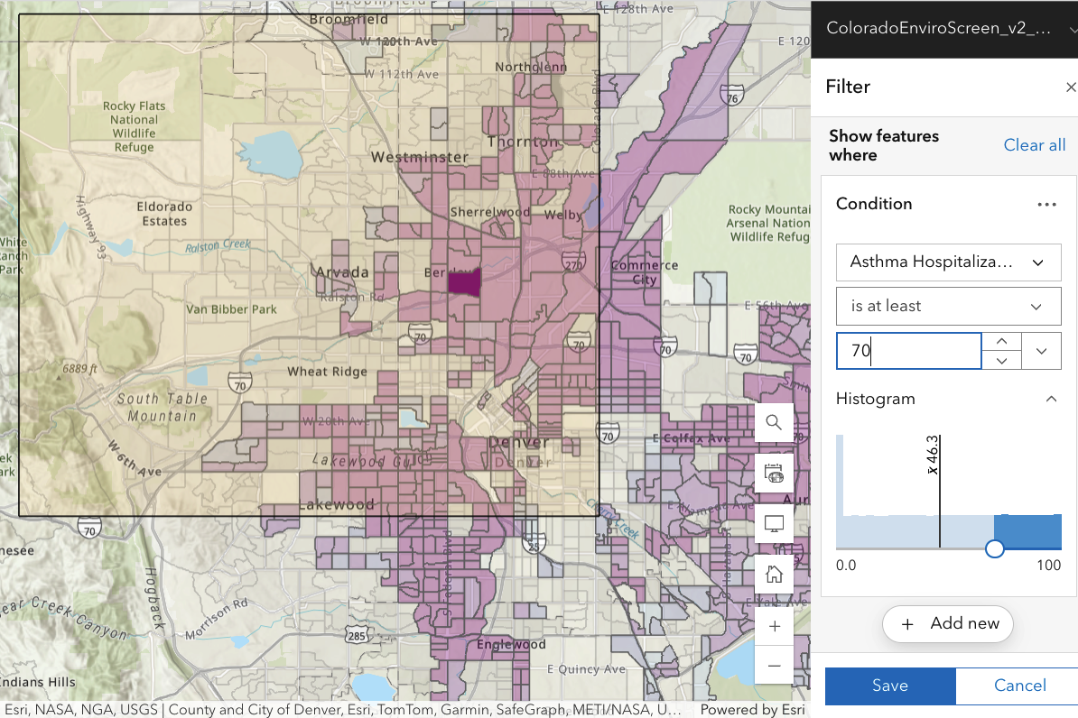
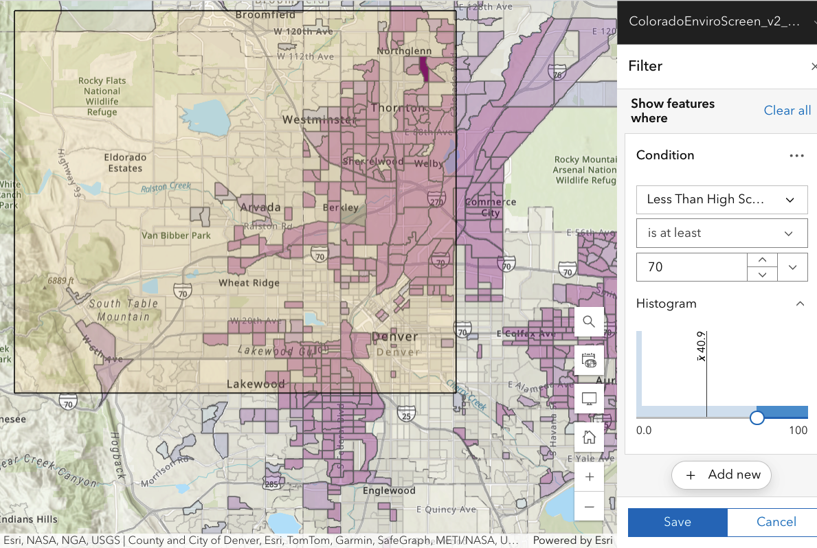
CDPHE has a very large amount of current health-related data for Colorado. A new interface (late November 2024!) for some of this data permits browsing graphically. I have selected the boundaries selected by the Rocky Flats Downwinders (see the right column) as part of their 2016 (not the ongoing) health survey of people they perceive to live downwind of Rocky Flats, since that’s what their map covers.
Apart from physical parameters (diesel particulate matter, toxic emissions into air, etc), other indicators are known to correlate with general health levels: smoking, age, education level (higher => higher income => better health care), etc. Similarly, cancer rates increase fairly strongly with age. But, of course, “correlation does not imply causation”.
The focus by the CDPHE on respiratory exposures may not appear directly relevant to Downwinders, but a 2016 journal article (based on studies of almost 69,000 residents of Hong Kong over age 65 in the interval 1998-2001 and followed until 2011) changes this. A reminder: PM2.5 stands for particulate matter smaller than 2.5 microns in (aerodynamic) diameter, an increasingly standard way of measuring particulate pollution. Authors compared a group with a specified level of PM2.5 exposure with other groups exposed to higher levels and measured the “hazard ratio” [HR], the ratio by which cancer deaths increased for each increase (10 micrograms per cubic meter) of PM2.5. They found
“Results: PM 2.5 was associated with increased risk of mortality for all causes of cancer [HR, 1.22] and for specific cause of cancer in upper digestive tract [1.42], digestive accessory organs [1.35] in all subjects; breast [1.80] in females; and lung [1.36] in males.”
A 22%-42% increase in cancer risk is really significant (and, by comparison, would require immense radiation doses). This means that a variety of cancers are much more strongly associated with air pollution than had been appreciated.
A non-technical overview may be found here.
None of the data shown below is epidemiology–there is no direct evidence that air pollution in the Denver metro area is correlated with (for example) cancer rates, much less causally connected.
The purpose of the collection of images below is to see what health data says about the Downwinder-selected region. In conventional epidemiology [“Hill’s criteria”] to establish a causal relation between plutonium exposure and illness, several things must occur: (i) greater exposure to Pu should lead to greater incidence of illness; (ii) the more specific is the association between plutonium (not other) exposure and the effect, the more likely there is a causal connection; (iii) a plausible biological mechanism is helpful. (Other CDPHE maps show histograms and mean values for the parameters we examine below.)
The sub-regions (little boxes, often) are “census block groups” (smaller than a “census tract’) with 600-3000 people, spatially adjacent. WARNING:
- Each time you change the parameter examined, the shading for a particular block group may change, meaning that the data for (say) diabetes in a block group is different from (say) exposure to diesel particulate matter there.
- Each time you change the percentile value, the entire MAP will change since block groups come and go [their shading switches on or off] as you (lower/raise) the percentile value and they are included or not.
The working assumption of Downwinders is that negative health impacts are more common among those exposed to Rocky Flats plutonium—that downwinders are sicker on average than other people. Thus in each case I have selected a value for the percentile [70%, see below] which is significantly higher than the median: this will tend to focus on those who are more ill than average, or more exposed to a particular risk factor (diesel particulates, for example).
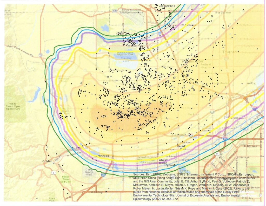
The map below (featured on the Rocky Flats Downwinders facebook page) shows the location of people who responded to their 2016 health survey. In the background is a map from Till et al. [Fig. 5]
Clumps of respondents may show neighbors who brought the survey to each other’s attention or even a disease cluster. However, such maps often reflect population density instead. For a disease of fixed incidence (for example, 40 per 100,000 people), there will be more cases in an area of high population density, appearing to give a cluster. `Cartograms’ which correct for this are shown elsewhere on the website (search for cartograms).
Where are areas of high population density in the CDPHE maps? The average population of a census block group is 1422 people, with appreciable variations. So the population density is roughly 1422/(physical area of block group). Thus areas of high population density correspond to areas where there are many small polygons (many block groups).
Focus on PERCENTILES
A particular index (say, the concentration of diesel particulates) may not have an obvious absolute meaning. However, by examining the distribution of measured outcomes, one can by calculate the percentile of a measured value—the fraction of all measurements which have a value less than that value. Then you can easily compare risk in a relative way. In all cases CDPHE data have been arranged so that the sickest/most exposed values are toward the high end of the percentile scale used.
For each map shown, assess for yourself whether the health impact or risk measure is
- focussed on people in the highlighted Downwinder map rectangle (and not present at comparable levels in other areas around the Denver metro area).
- larger for those closer to Rocky Flats.
If true, these two criteria could make plausible effects due to Rocky Flats.
Documents elsewhere on this website show that there is no plausible biological mechanism by which any downwinder can accumulate a significant radiation risk from plutonium from Rocky Flats.
Many features change abruptly along the north/south line of Sheridan Blvd. This is almost definitely due to differences between how or whether health statistics are handled, not a sudden change in risk or physical parameters related to risk.
There are captions for each map–keep the mouse over the map part to see it as you click through the images. Complete and recent documentation of Colorado EnviroScreen v2.0 is available here.
